A new Maison&Objet identity, a bespoke typographic alphabet
Published on 26 March 2026
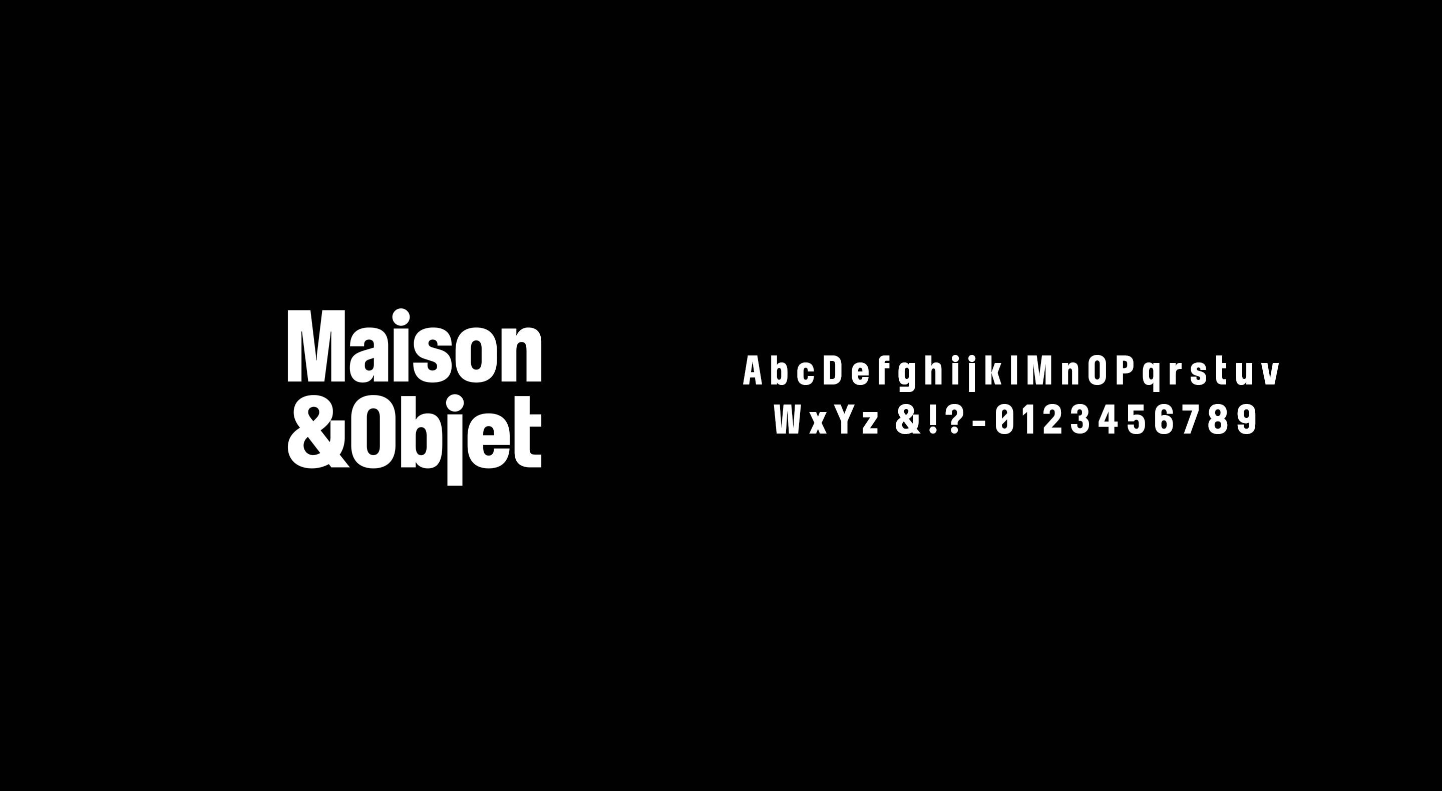
In 2026, Maison&Objet unveils a new face. A renewed identity begins to take shape, reflecting both a vision and a vibrant, inspiring community. At its core lies a transformation of the brand’s typographic language, developed in collaboration with Edouard Berard, graphic and type designer.
Let’s begin with your academic journey.
E.B.: I founded my graphic and type design studio in 2023, following a Master’s degree in Typeface Design at ECAL in Switzerland, after completing a Bachelor’s degree in Media Design at the Glasgow School of Art in Scotland. Very quickly, meaningful collaborations emerged, and the studio naturally found its momentum.
Your practice spans a wide range of collaborations. Could you tell us more?
E.B.: I work across different contexts, from studios such as the Studio Hugo Blanzat and UZIK - notably on the bespoke typographic identity I designed for Maison&Objet - to magazines rooted in the worlds of art and fashion, as well as brands and established houses.
How would you describe your visual language?
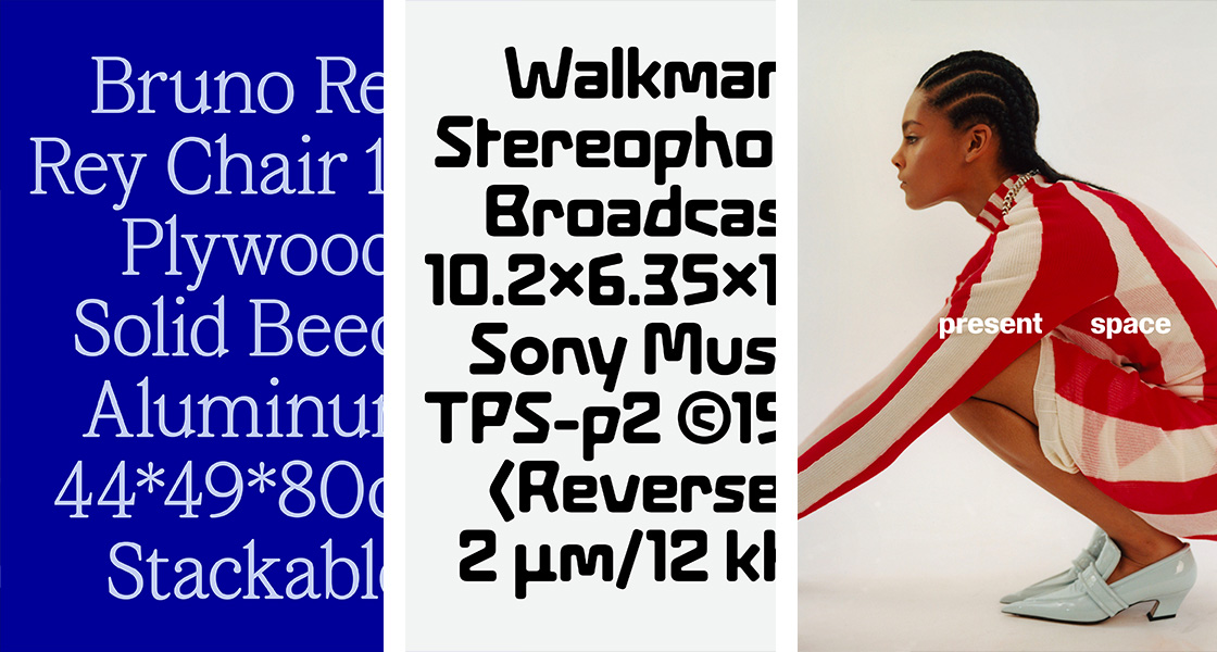
E.B.: I’m drawn to typographic specimens and to the nuances of print - its textures, its irregularities. I aim to create identities that are instantly recognisable, drawing as much from historical references as from contemporary forms. Contrast plays a central role in my work; it allows me to challenge conventions and bring a sense of renewal to the typographic landscape. Each project calls for a distinct response, shaped by its context, its audience, and its positioning.
As a designer with a curious eye, where do you find inspiration?
E.B.: Inspiration is everywhere — it comes from observing, collecting, noticing. Within my field, I feel particularly close to the work of Porto Rocha in New York, as well as independent studios such as John Morgan and Daly Lyon in London. Among type foundries, I’m especially inspired by ABC Dinamo in Berlin and Fonderie Abyme in London.
Maison&Objet embodies a vision, a community, and a renewed identity… What did this creative challenge involve?
E.B.: Maison&Objet is a global ecosystem, bringing together multiple platforms: Paris Design Week, In the City, Maison&Objet Interior, and Maison&Objet&More, its digital extension. It is a leading voice across design, decoration, and the art of living.
The challenge was to create a typographic language capable of unifying this rich and multifaceted community.
The approach was to design a visual system with a strong yet nuanced presence, reflecting the evolution of a brand with a well-established heritage. The result is a bespoke sans-serif alphabet (a custom-designed typography) - contemporary, geometric, and assertive in its visual impact.
A new way of reading the brand.